

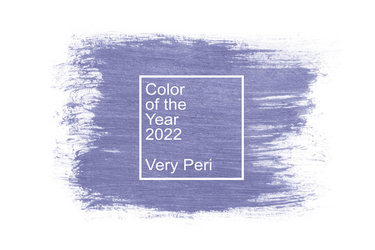
It’s always exciting to see the color of the year introduced each December. This year, Pantone color of the year 2022, was custom-created. This is huge! Because in the past, it was the norm to choose the colors from an existing Pantone swatch catalog, and today we have a new color: Very Peri!
When did Pantone Color of the Year Start?
The company Pantone LLC dates back to 1962, founded in New York. Since then, the company has relocated its new headquarters to Carlstadt, New Jersey. Though the company has been around for quite some time, it was not until 1999 that they decided to have a color of the year. This decision started a new design trend for many to follow. Pantone’s colors inspire new waves for creatives worldwide, from fashion houses to graphic designers. This year marks the 22nd announcement of the year’s color, and it is my favorite yet. Veri Peri is a beautiful purple, a close cousin to the periwinkle pallet. It is super easy to use for design ideas because it has warm and cool tones that could complement many colors or be powerful on its own.
Best Pantone Colors of the year in years past:
- 2009 – Turquoise 15-5519
- 2010 – Honeysuckle 18-2120
- 2011 – Tangerine Orange 17-1463
- 2013 – Radiant Orchid 18-3224
- 2014 – Marsala 18-1438
- 2015 – Serenity 15-3919
- 2017 – Ultra Violet 18-3838
- 2019 – Classic Blue 19-4052
- 2021 – Ultimate Gray 17-5104 + Illumination 13-0647
How Does Pantone Choose the Color of the Year?
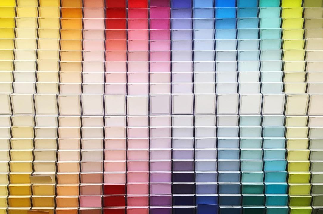
Most people do not think twice about Pantone’s process to choose the following year’s color, but believe it or not, there is a process. Pantone’s board does not randomly pick a color; it is essential to the company to discuss it thoroughly, have a method, and a why. The color is determined based on certain factors such as design trends and various industries like fashion, marketing, social media, and politics. Once a year, the company holds a secret meeting in a colorless room with representatives from different countries and color standards groups. The main objective is to narrow the color down from around 2,100 to just one color for that year.
What Very Peri Means
According to Leatrice Eiseman, Executive Director of the Pantone Color Institute, Very Peri was created during a time of unprecedented change to ignite feelings of joy and energetic expressions. As a whole, purple hues (specifically lighter shades) are meant to evoke more intense and cheerful emotions. However, they can also represent feelings of regality, courage, and inventiveness. The color Very Peri also stands for the transition we are going through in life and transformative times. This color sparks creativity and brings joy. All these ideas together are what make Very Peri so unique. It’s adaptable, and you can use it within any project you may come across.
I really like Very Peri (and it isn’t because purple happens to be one of my all-time favorite colors)! It’s a striking color that can be utilized across many different platforms, whether within the digital or physical space. In addition, its blend between periwinkle blue and violet undertones lends itself to spark lots of creativity and imagination.
How Pantone Landed on Very Peri As the Color of 2022
Pantone’s color experts took a different approach to the decision for this year’s color this year. Usually, the color comes from the company’s large selection of colors. However, this year the approach was different; they created a brand new color. Given that the color represents global innovation and transformation, it seems fitting to be innovative. Vice President Laurie Pressman mentions, “As society continues to recognize color as a critical form of communication, and a way to express and affect ideas and emotions and engage and connect, the complexity of this new red-violet infused blue hue highlights the expansive possibilities.”
So, how can I incorporate Very Peri into my projects?
Many people would assume that incorporating the Pantone Color of the Year into your business or brand isn’t possible. However, the Color of the Year was never intended to rebrand or change your company’s color scheme but to enhance it. Below are some of how you can include Very Peri into your advertising or business collateral.
Very Peri may be included within:
- Social media or digital advertising tactics.
- Merchandising or product lines.
- Interior design space.
- Any graphic design template.
- The fashion space.
In Conclusion
No matter how you incorporate Very Peri into your projects, remember to always have fun with it whether you need just a splash of color or want to create a bold statement. The color properties for Very Peri are listed below, so you can start creating!
Very Peri Color Values:
Pantone: Pantone 17-3938 TPG
RGB: 102, 103, 171
Hex/HTML: #6667AB
CMYK (approximation): 40, 40, 0, 33
Krush is a full-service advertising agency in Oklahoma City. We specialize in brand development, graphic design, media planning, performance tracking, print services, SEO, social media, video services, as well as website design and development. Our focus is to grow your brand and your bottom line–we are your strategic marketing partner! Check out our portfolio of work and contact Krush today!
