What Can Brown Do for You?
While it’s been several years since UPS used this as their slogan, the color brown is still very closely associated with their brand. You instantly know who you are dealing with when you see that brown uniform on your porch ringing your bell.
Whether your brand has been around for years or you are contemplating starting a new one, here are some considerations concerning color as it relates to your brand image.
Color Matters
Let’s start with the first major obstacle for many people. Color is important. Colors communicate subtle and not so subtle messages constantly. Your color strategy shouldn’t be random. If you’ve chosen brand colors purely based upon what is appealing to you personally, you might be sending a message that confuses, distracts, or even alienates your potential audience.
Most people understand the basics of warm colors (yellows, reds, and oranges) and cool colors (green, blues, and purples). This is a great place to start. Think of your brand. If you were forced to choose between defining your brand as warm or cool, which would you choose? Neither of these choices is bad or wrong, but for some industries, let’s say fast food, cool colors would be inappropriate.
Warm colors stimulate the appetite and create a sense of urgency. This is perfect for fast food where you want your consumers to be hungry and eat quickly clearing booth space for the next customers. McDonald’s does this brilliantly with their use of color. Red and yellow stimulate our appetite, but humans don’t enjoy being surrounded by reds, yellows, and oranges for long periods of time.
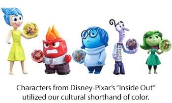
Colors Communicate Cultural Shorthand
All of us have our own personal associations with different colors, but on a larger scale, cultures themselves have color associations. This allows you to leverage these associations efficiently for your brand. Below are some of the most common color associations in the West followed by a specific American cultural association.
Red: passionate, exciting, fervent, anger—danger (yet, pink is soft and feminine)
Yellow: cheerful, inspiring, high spirit—cowardize
Blue: tranquility, understanding, patience, devotion, depression—masculine
Green: quieting, refreshing, peaceful, growing—envy
Orange: jovial, lively, energetic, autumn—Halloween
Purple: dignified, pompous, mournful, mystic—royalty
Black: darkness, ominous, deadly, depressing—mourning
White: delicacy, purity, cold, cleanliness—surrender (and, ironically wedding dresses)
There are specific color combinations which have such significance in our American culture, it makes them nearly impossible to use without people drawing these associations. The combination of Red & Green alone is almost always associated with Christmas while black and orange are Halloween.

Colors have a physiological impact on humans
Significant amounts of color, as in an entire room with a strong dominant color, can actually have a physical effect on you as well as a change in your perception. The color red actually has a strong physical effect on human metabolism. When a human is surrounded by enough red for a substantial amount of time it can increase respiration and even raise blood pressure.
Many different studies have shown colors can affect how you perceive the temperature in a room. For example, in a room painted dark orange with a constant temperature of 75°, subjects reported the temperature to feel up to 10° hotter than it actually was. The same was found to be true of rooms painted with light blue with a constant temperature of 75°. Subjects reported the temperature feeling up to 10° cooler.
Let’s put this information into a practical application. You are a retailer and one of your brand colors is a bright red. The front of your store is predominantly glass and south-facing. Keeping your showroom cool in the summertime is already going to be a struggle for you. If you decided to predominantly paint your showroom with your brand color, bright red, even though you struggle to keep the temperature at 75°, your customers may “feel” like it’s 85°.
Another example of the physical effects of color is appetite. I’d like you to imagine eating a blue banana. I mean that banana is the color of a Smurf. Go ahead. Try it.
If you are anything like most humans, your stomach turned over a bit at just the suggestion of a blue banana. Humans are hardwired to avoid foods that might make us sick. Blue is one of those colors that just doesn’t occur naturally in many foods. Even blueberries are not blue, blue.
If you are of a certain age and geographic location, you might remember the “Blue Plate Special” that became a tradition in diners across the country. Some dieticians recommend using blue plates if you are attempting to lose weight as the color blue will suppress your appetite causing you to consume less than you otherwise would. I’m not sure how effective that technique is for weight loss but I know one trick that will absolutely work—replace the bulb in your refrigerator with a blue-light bulb. Imagine opening the fridge for that late-night snack and all of the food inside appearing bluish. Blue milk anyone? Yuck.
Have a Color Strategy
I’d suggest creating a strong strategy when it comes to the colors you use in your brand. Color is not the easiest thing to change once you’ve launched it throughout your store, uniforms, transportation, packaging, printed materials, etc. You’ve put huge resources behind your business plan, so why wouldn’t you put as much thought into what your colors communicate about your brand?
When done effectively, appropriate usage of color can strengthen and unify your brand message. It can allow you to use cultural associations to subtly communicate abstract concepts on behalf of your brand. It’s certainly something you don’t want to leave undone.
Krush is a full-service advertising agency in Oklahoma City. We specialize in brand development, graphic design, media planning, performance tracking, print services, SEO, social media, video services, as well as website design and development. Our focus is to grow your brand and your bottom line–we are your strategic marketing partner! Check out our portfolio of work and contact Krush today!


